Card
Intro
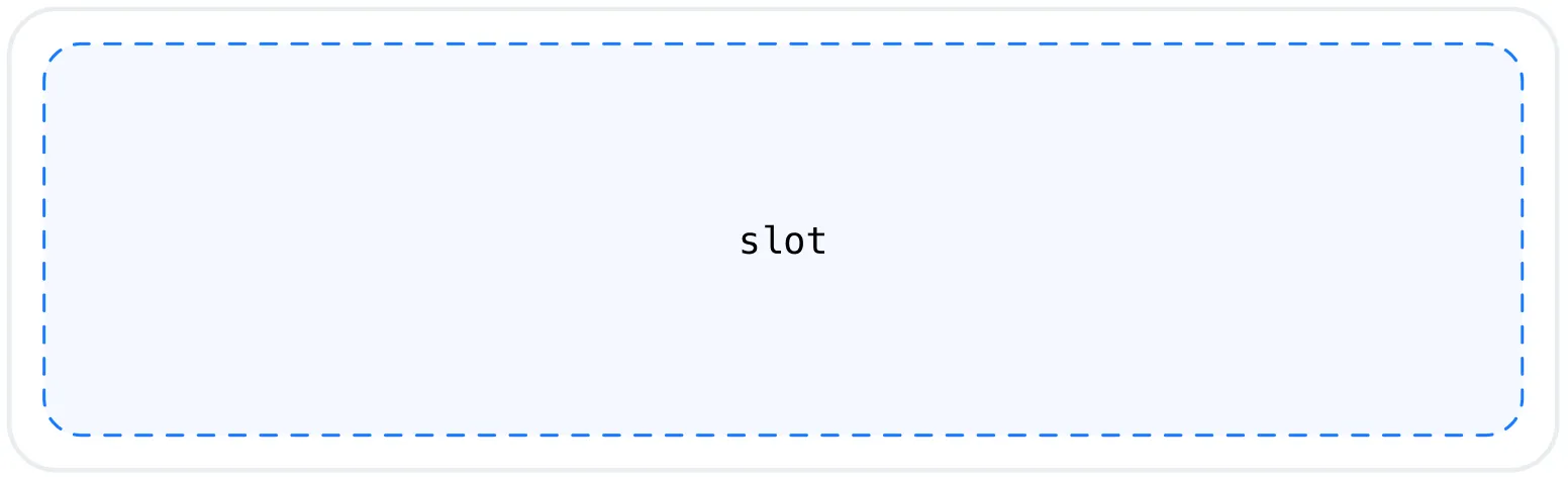
The Card component provides a content wrapper with the default card styling used by all widgets. It can also be used to create custom blocks that maintain visual consistency with the widget system. On its own, it acts as an empty container, allowing you to pass custom content via its slot.
Set-up
Styling
The Card component inherits the same styling as the widgets by default. It uses the --ip-widget-* CSS variables, ensuring visual consistency across all components. You can override this behavior in two ways:
- Globally, by updating the --ip-widget-* variables (affects both widgets and the Card component). See theming infotheming.
- Specifically for the Card, by targeting the ip-card element directly or by defining the --ip-card-* variables
The --ip-card-* variables are optional and not set by default. When not defined, they fall back to the corresponding --ip-widget-* values. This allows you to customize the Card component independently while maintaining shared defaults.
CSS variables | Fallback |
|---|---|
--ip-card-border-width | --ip-widget-border-width |
--ip-card-border-color | --ip-widget-border-color |
--ip-card-border-radius | --ip-widget-border-radius |
--ip-card-background-color | --ip-widget-background-color |
--ip-card-text-color | --ip-widget-text-color |
Usage
<ip-card>
  <!-- Your content here -->
</ip-card>
Example